




Over the years I have made many works of art in many different mediums as well as styles. I have found my most favorite to be Acrylic Paint as well as Color Pencil, I have worked with these mediums a handful of times during my art 1, 2, and 3 classes! All of my work over these past years has been made from inspiration deriving from past memories, culture, and daydreams. Meme culture has always been a big inspiration to me and you can see it in most of my work. As a kid I was always ecstatic over art, my first experience with art came from my grandma, she always drew birds and tried to teach me how to draw with her, but that didn't work out as planned of course.
I started my art career officially in 7th grade, I bought my first sketch book and practiced with ideas I found on Pinterest. To this day I carry all my old sketches in my new and main sketch pad wherever I go. As a kid I loved to color, and probably used up every coloring book in the house. Though when I was in 7th grade I stopped using color, as I thought it made my art look out of shape, it never fit in so I completely cut out color for a year or two from my art projects. I've recently got back into adding color and I fondly believe that I'm doing a great job at it.

Art Projects Through The Years
Blu

Instaham
Le worm on le string
.jpg)
.jpg)
Rest in Pepporoni
Brittain
Acrylic 2021
The name of this project is Rest in Pepporoni and the medium is Acrylic Paint. The only personal meaning behind this project, is the fact that I made it, otherwise it’d mean nothing. I also thought it would be funny.
This project completes the assignment by being on time, and by being done in an medium. The process I used was painting and talking and listening to music, as I drew the layout first, then the gray scale background, followed by the tombstone, then the raven, and the flowers and such. The principle I used in this project is space. Providing the space in the flowers and jar creates the illusion of realistic scaling. The element I used in this project is line, I used a ruler to create very strait lines for the tombstone and lettering.
.jpg)
Worm on le String
Brittain
Color Pencil, 2022
The name of this work is Worm on le String, and the medium it is represented in is color pencil. It is depicted in this work, a worm on a string, and a person sitting on a stump. They are lost in thought, the only thoughts they have had were taken over by a worm on a string appearing in space, speaking an unknown language. The person in this work doesn’t look happy with what is happening, but they aren’t necessarily sad either. They are content with it; they are happy that they are at the very least occupied by a worm.
This project completes the given assignment by using color pencil and creativity. The process I had behind this was originally going to be to first draw it with pencil, and then use ink as my medium, but I opted out and chose color pencil to color everything in. The element used in this work is form, for is the way that a shape or physical configuration occupies space. I used this by making the worm take up almost the entirety of the thought bubble. The principle I used in this piece was variety, variety adds interest to an artwork.
You are now entering 2023
My first project of 2023


Isle Unto Thyself
The name I have bestowed upon this project is Isle Unto Thyself, the medium is in Prisma colors. This artwork displays bits of my dreams, or at least the parts I could remember. Dreams are very important to me, and I am just now learning about how important they are in moderation.
The elements I used in this art piece are texture, and space. If you look closely, you can see the difference in texture of “the cat” compared to “the hand”. I made the textures different to display how vivid each is to me to this day. You can see the lines I made in the cat to make it appear fuzzy, and you can see how rough the hand is to represent how old and beaten down it is. You can see how I used space to make the art more distant in each bit. The cat appearing super close, and the bed being further away is an example of this. The principles I used in this art piece are variety and emphasis. You don’t have to look closely to see the variety of colors used in this art piece. Each object has different colors for a reason, and each one is used on purpose. This is to emphasize how real I thought the dream was at the time, for example the object being red, or colors darker than red meant “very real” and lighter colors than red being “not so real, just weird”. The colors also give emphasis to the importance of each object.
.png)
.png)
Bacon Pancakes
.png)
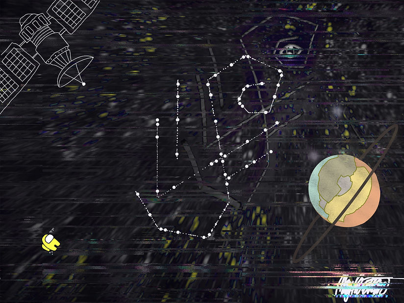
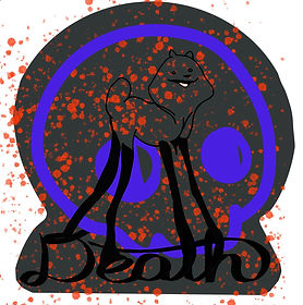
The name I have chosen to give this project is Bacon Pancakes, because right now I am craving bacon pancakes. The medium is Digital. These art pieces show some sparks and rushes of creativity that the style of graffiti can influence. Graffiti has been of importance to me for as long as I can remember.
The elements I used in this art piece are line and shape. In each piece I used varieties of lines and shapes to make certain sections of each piece “pop”. The shapes that surround the shark are like eye candy, as well as the blood splotches next to the dog, and the tiny shapes that cover the area around the fox. I used lines to help connect the “dogs” legs to the word “Death” as well as lines in the sharks’ teeth, and lines to make the cut-out area around the fox.
The principles I used were rhythm and unity. You can see that unity is used in the shark piece, by hoarding your attention to its glowing eyeball, the eyeball being the center of the art piece. In the “dog” piece, you can see that the attention is drawn towards the smile on its face. In the fox piece, the attention is simply drawn towards the entirety of the fox.
.png)
Bingus
The name I’ve bestowed upon this art piece is Bingus, because Bingus is an internet meme that’s been going around since 2020. The medium is pen & ink. This art piece shows a hairless cat, with a snail resting upon its head. This art piece symbolizes simplicity.
The elements I used in this piece of art were line and texture. You can see the lines I used throughout the project to take the place of shaded areas. Since we don’t have any colors other than black, and the blank space of the canvas, I had to make due by giving the illusion that there are in fact shadows. You can also visually see how I used texture. On the blanket that keeps Bingus warm, you can see small lines that take the place of the fabric’s texture.
The principles I used in this project are contrast and pattern. In the background tiles you can see the lines that layout the pattern for each individual tile. I did this just for the pizzaz. The contrast that is in this art piece can be found in the wrinkles of Bingus. The wrinkles need to be there so the cat doesn’t look smooth and lifeless.

Futile
The name of this art piece is Futile, and the mediums are paint and marker. Futile means incapable of producing any useful result; pointless. Why did I give my art piece this name? Because there are times when I feel like my art is a futile attempt to show who I truly am. A lot of people will use art to express how they truly feel. Those pieces are usually abstract art, and fragments of ideas mushed together. I feel like I can not produce abstract art without the whole thing being incomprehensible. And I understand that abstract art isn’t always meant to be comprehensible, but I would like to be understood. Hence why I created this piece. The personal meaning behind all of these doodles can be interpreted bit by bit. All together one artwork does not make sense, but zeroing in on a single object or focal point will.
One artist that has influenced me to express myself in such a way is Kiatanan Iamchan. One work in particular of his always catches my eye, and that artwork is called The Way to Ny. His work displays how he himself sees society in Thailand. His inspiration comes from murals in temples that were created there. His works express the concepts and feelings of life in positive and negative ways, as well as adhering to the vision and guidance of Buddhism to the mind. He believes by drawing a mixture of semi-animation and semi-reality, art as a belief of obedience. There is a huge difference between what he makes and what I make. His are jam packed with creations and animations, making everything work together and make one huge scene. My art shows many small scenes on a single canvas, there truly is not one singular focal point.
The reason I love art so much is because of its freedom in expression, some people make art out of dead hair, mud, recycled bottle caps, and couch cushion lint. While others, like me, use traditional paint and graphite. There are no limitations. My favorite parts of the year were sitting with friends everyday and talking the entire hour, to then realize that we have 2 weeks left to do our project and I have only 15% of it done. I don’t think I’d trade that for anything else if I’m being completely honest.
Kiatanan Iamchan was born in 1982 his hometown was Lopburi, Thailand. Kiatanan has gone to many different schools for art, and of course for his career in art, these schools are as follows: Jindarat School, Banjongrat School, Phra Narine School, and Lopburi Technical College. Kiatanan has won many awards, to name a few he won 1st Prize, Gold Medal, Painting section of The 55 National Exhibition of Art. First Prize of “The 8th Panasonic Contemporary Painting Exhibition”. And Merit Prize of XVIII Toshiba “Bring Good Things to life” Art Competition of 2006.
Kiatanan had a handful of exhibitions throughout his career a total of 46 exhibitions from the year 2002 to 2018